
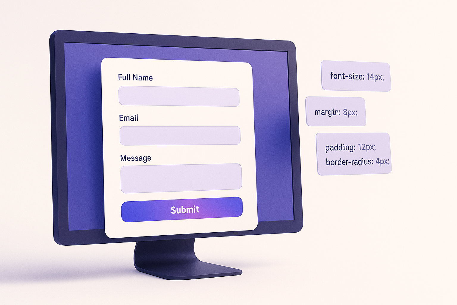
For a current Gravity Forms form, start with the Orbital theme and its block settings, use the Form Editor for columns and submit-button placement, then add scoped CSS only for styles the editor cannot express. Orbital exposes a documented CSS API with custom properties such as --gf-color-primary, --gf-ctrl-radius, and --gf-form-gap-y, so you can change a form’s design without overriding every input selector.
The examples below target Orbital’s current Theme Framework. Replace form ID 12 and field ID 4 with the IDs from your form.
Choose Orbital or the Gravity Forms 2.5 theme first
Gravity Forms has two relevant styling systems:
- Orbital: the Theme Framework implementation with block-level appearance settings and the current
--gf-*CSS API. - Gravity Forms 2.5 theme: the earlier modern-markup theme, which uses legacy selector documentation rather than Orbital’s full CSS API.
When embedding a form with the Gravity Forms block, select Orbital in the block settings if you want the current visual controls and code examples in this guide. A form can look different in two locations when its embeds use different themes or different block settings.
Do not build a new layout around old classes such as gf_left_half, gf_right_half, or gf_simple_horizontal. Gravity Forms deprecated the column Ready Classes after adding columns to the Form Editor in 2.5, and deprecated the simple-horizontal class after adding submit-button placement in 2.6. Gravity Forms also says legacy markup support is scheduled for removal in 4.0.
Find the wrapper, field, input, and button IDs
Gravity Forms uses predictable IDs:
#gform_wrapper_12— wrapper for form 12;#field_12_4— field 4 in form 12;#input_12_4— the primary input for that field; and#gform_submit_button_12— submit button for form 12.
Inspect the public form in browser developer tools to confirm the rendered markup. Compound fields such as Name and Address have additional input IDs, and an inline submit button is rendered in #field_submit rather than the normal footer.
Use the narrowest stable scope:
/* Every Orbital form */
.gform-theme--framework { }

/* Only form 12 */
.gform-theme--framework#gform_wrapper_12 { }

/* Only field 4 in form 12 */
.gform-theme--framework#gform_wrapper_12 #field_12_4 { }
A form-specific wrapper prevents a checkout, registration form, and contact form from inheriting the same design accidentally.
Copy-ready Orbital CSS examples
Apply brand colors and control styling
.gform-theme--framework#gform_wrapper_12 {
  --gf-color-primary: #4f46e5;
  --gf-color-primary-darker: #3730a3;
  --gf-ctrl-bg-color: #ffffff;
  --gf-ctrl-bg-color-hover: #f8fafc;
  --gf-ctrl-border-color: #cbd5e1;
  --gf-ctrl-radius: 8px;
  --gf-ctrl-label-color-primary: #0f172a;
  --gf-ctrl-desc-color: #475569;
}
This works through Orbital’s CSS API, so text inputs, selects, textareas, and related controls inherit a consistent baseline. Check contrast in default, hover, focus, error, and disabled states after changing colors.
Set a readable form width and field spacing
.gform-theme--framework#gform_wrapper_12 {
  max-width: 720px;
  margin-inline: auto;
}

.gform-theme--framework#gform_wrapper_12 .gform_fields {
  --gf-form-gap-x: 20px;
  --gf-form-gap-y: 24px;
}
Use the Form Editor to decide which fields share a row. Use the gap variables to control the space between those rows and columns. This separates layout structure from visual spacing.
Style the submit button
.gform-theme--framework#gform_wrapper_12
.gform_footer input[type="submit"].gform_button,
.gform-theme--framework#gform_wrapper_12
.gform_page_footer input[type="submit"].gform_button {
  --gf-ctrl-btn-bg-color-primary: #4f46e5;
  --gf-ctrl-btn-bg-color-hover-primary: #3730a3;
  --gf-ctrl-btn-color-primary: #ffffff;
  --gf-ctrl-btn-radius: 8px;
  --gf-ctrl-btn-font-size: 16px;
  --gf-ctrl-btn-font-weight: 700;
  --gf-ctrl-btn-padding-x: 24px;
}
This covers normal and multi-page footers. If the submit button is placed at the end of the last row, target the inline container:
.gform-theme--framework#gform_wrapper_12
#field_submit input[type="submit"].button {
  --gf-ctrl-btn-bg-color-primary: #4f46e5;
  --gf-ctrl-btn-bg-color-hover-primary: #3730a3;
  --gf-ctrl-btn-color-primary: #ffffff;
}
For a full-width button, use Submit Button → Width → Fill Container in the Form Editor. That setting applies the supported full-width class without another override.
Style one field with a custom class
Add oj-priority-field in the field’s Appearance → Custom CSS Class setting, then target that class:
.gform-theme--framework#gform_wrapper_12
.gfield.oj-priority-field {
  padding: 16px;
  border: 1px solid #c7d2fe;
  border-radius: 10px;
  background: #eef2ff;
  --gf-ctrl-border-color: #818cf8;
}
A meaningful custom class survives label edits and is easier to understand than a long selector tied to the field’s current type.
Style placeholders without replacing labels
.gform-theme--framework#gform_wrapper_12
input::placeholder,
.gform-theme--framework#gform_wrapper_12
textarea::placeholder {
  color: #64748b;
  opacity: 1;
}
A placeholder is an example or hint, not a persistent label. Keep visible labels for clarity and accessibility.
Increase checkbox and radio control size
.gform-theme--framework#gform_wrapper_12
.gfield--type-choice {
  --gf-ctrl-choice-size: 22px;
  --gf-field-choice-gap: 12px;
}
Test long option labels, keyboard focus, and the actual clickable label area. A larger square or circle does not help if the label is difficult to activate.
Style descriptions and required indicators
.gform-theme--framework#gform_wrapper_12
.gfield_description {
  --gf-ctrl-desc-color: #475569;
  --gf-ctrl-desc-font-size: 14px;
  --gf-ctrl-desc-line-height: 1.6;
}

.gform-theme--framework#gform_wrapper_12 {
  --gf-ctrl-label-color-req: #b91c1c;
}
Do not communicate required or error states with color alone. Preserve the required text or symbol and the validation message.
Style validation errors
.gform-theme--framework#gform_wrapper_12
.gform_validation_errors {
  border-left: 4px solid #b91c1c;
  border-radius: 8px;
}

.gform-theme--framework#gform_wrapper_12
.gfield_validation_message {
  --gf-ctrl-desc-color-error: #991b1b;
  --gf-ctrl-desc-font-size-error: 14px;
  font-weight: 600;
}
Submit an invalid form after styling. Confirm that the summary, field message, invalid control, and focus movement remain understandable.
Use the Layout Editor instead of Ready Classes
For half-width, third-width, or mixed-width rows, drag fields into columns in the Form Editor. The public form will collapse the grid responsively according to the theme framework.
For an email field and submit button on one row, place the submit button at End of the last row. The old gf_simple_horizontal class is a legacy fallback, not the starting point for a new form.
Existing forms that use gf_left_half and similar classes should be migrated before Gravity Forms 4.0. Record the current layout, reproduce it with editor columns, check mobile stacking order, and remove the old class only after the public embed matches. Gravity Forms maintains a current Ready Classes migration reference for these mappings.
Add a form or field custom CSS class
Gravity Forms can add a custom class at two levels:
- Form Settings → Form Layout → CSS Class Name: a value such as
oj-contactbecomesoj-contact_wrapperon the form wrapper. - Field → Appearance → Custom CSS Class: the class is added directly to that field wrapper.
A form-class example:
.gform-theme--framework.oj-contact_wrapper {
  --gf-color-primary: #0f766e;
  --gf-color-primary-darker: #115e59;
}
This is more portable than hardcoding an ID when the same design will be applied to a known class of forms.
Where to put Gravity Forms CSS
Use an update-safe location that loads on the public page:
- a child theme stylesheet;
- the site editor or theme’s supported custom-CSS area;
- a page builder’s site-wide or page-level CSS feature; or
- a small site-specific plugin that enqueues a stylesheet.
Do not edit Gravity Forms plugin files or a parent theme stylesheet. Those changes can disappear on update. For a large site, keep form CSS in version control and group rules by the form class or ID they affect.
Why Gravity Forms custom CSS is not working
The form uses a different theme
Orbital selectors start with .gform-theme--framework. If the wrapper has .gform-theme--no-framework, the form uses the Gravity Forms 2.5 theme and needs its legacy selector documentation. Check the public wrapper, not only the block editor.
The form ID or field ID is wrong
Inspect the rendered wrapper and field. The first number is the form ID and the second is the field ID. Do not copy an example’s 112 or this guide’s 12 unchanged.
The CSS loads before a more specific rule
First scope the rule to the exact form wrapper and use the relevant Orbital variable. Load site-specific CSS after the theme or builder CSS where possible. Add !important only after identifying the competing declaration; it makes later state and responsive overrides harder.
The editor preview and frontend differ
The public page also includes the active theme, page builder, cached CSS, and embed-specific Orbital settings. Use Preview for structure, but verify the real page at desktop and phone widths.
A cache serves the previous stylesheet
Purge the relevant page/cache layer, update the stylesheet version, and check the browser’s Network and Styles panels. Do not keep increasing specificity when the browser has not downloaded the new file.
A submit button was hidden with display: none
Gravity Forms documents that display: none on the submit button can abort the submission handler. Use submit-button conditional logic when the button should be unavailable, or use an accessible visually hidden technique only when the workflow truly requires it.
Test styling without breaking the form
- Submit valid and invalid values with a keyboard.
- Check labels, descriptions, required indicators, focus rings, and errors at 200% zoom.
- Test editor columns at narrow mobile widths and confirm a logical reading order.
- Test conditional fields, multi-page navigation, file uploads, enhanced selects, and inline submit buttons used by the form.
- Verify contrast for normal, hover, focus, disabled, and error states.
- Repeat the test on the real cached public page after deploying CSS.
Start with Orbital variables because they work with the framework instead of fighting it. Use a form-specific wrapper for safety, the Layout Editor for structure, and direct selectors only for the final details the CSS API does not cover.

